Brand Guidelines
An overview of how to use our brand assets to ensure consistency and confidence.
Introduction
We strive for a consistent and effective brand presence in everything we create. If we make something, we want to make sure that people know where it came from. The following pages contain guidelines that we hope will help you communicate our values, realise our vision, and reinforce our brand.
This guide is not a comprehensive list of rules. We recognise the creative journey is full of twists and turns. New approaches, new trends, and changes in technology will inevitably have an effect on our brand and the way we execute it visually.
Please refer back to this guide often. We believe that our style guide is a living document. It should evolve over time, just as our brand inevitably will.
If you have any questions regarding the content of this guide, please don’t hesitate to contact the marketing team.
Brand Logos
Our logo is how our customers tell us apart from a crowded industry. It’s a promise of quality, consistency, and reliability. As such, our logo must be presented correctly in every execution.
Wordmark
The Wordmark is our primary logo and the brand’s key visual identifier. Lead with this on all marketing touchpoints where space permits, or when the brand has not yet been established.
Wordmark – This incorporates the icon.
Icon
The Icon is a condensed version of the logo. Use the icon on its own only if you do not have enough room for the full logo or in cases when the IO brand has already been established.
Icon – This is a condensed version of our logo.
Legibility
Our Wordmark and Icon should always be legible and impactful. Always apply the exclusion zone to isolate the logo from competing visual elements such as a busy area of an image, low-contrast areas where legibility is compromised, or on top of text or supporting graphics. The exclusion zone is equal to half the height and width of the ‘i’ character.
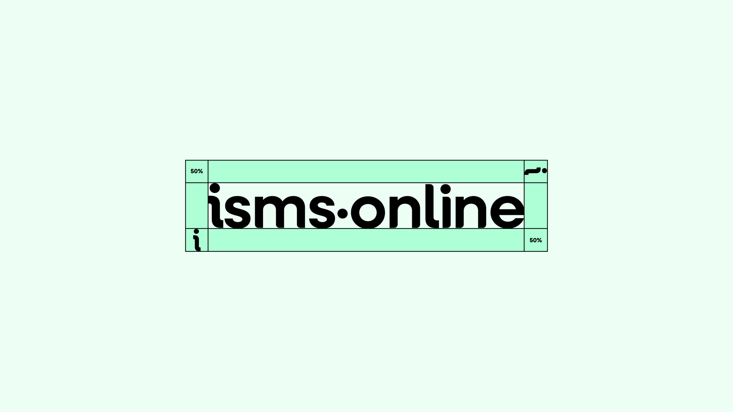
Wordmark – Exclusion Zone
Icon – Exclusion Zone
Misuse
The appearance of the Wordmark and Icon must remain consistent. They should not be misinterpreted, modified, or added to. Their orientation, color, and composition should remain as indicated in these guidelines with no exceptions.
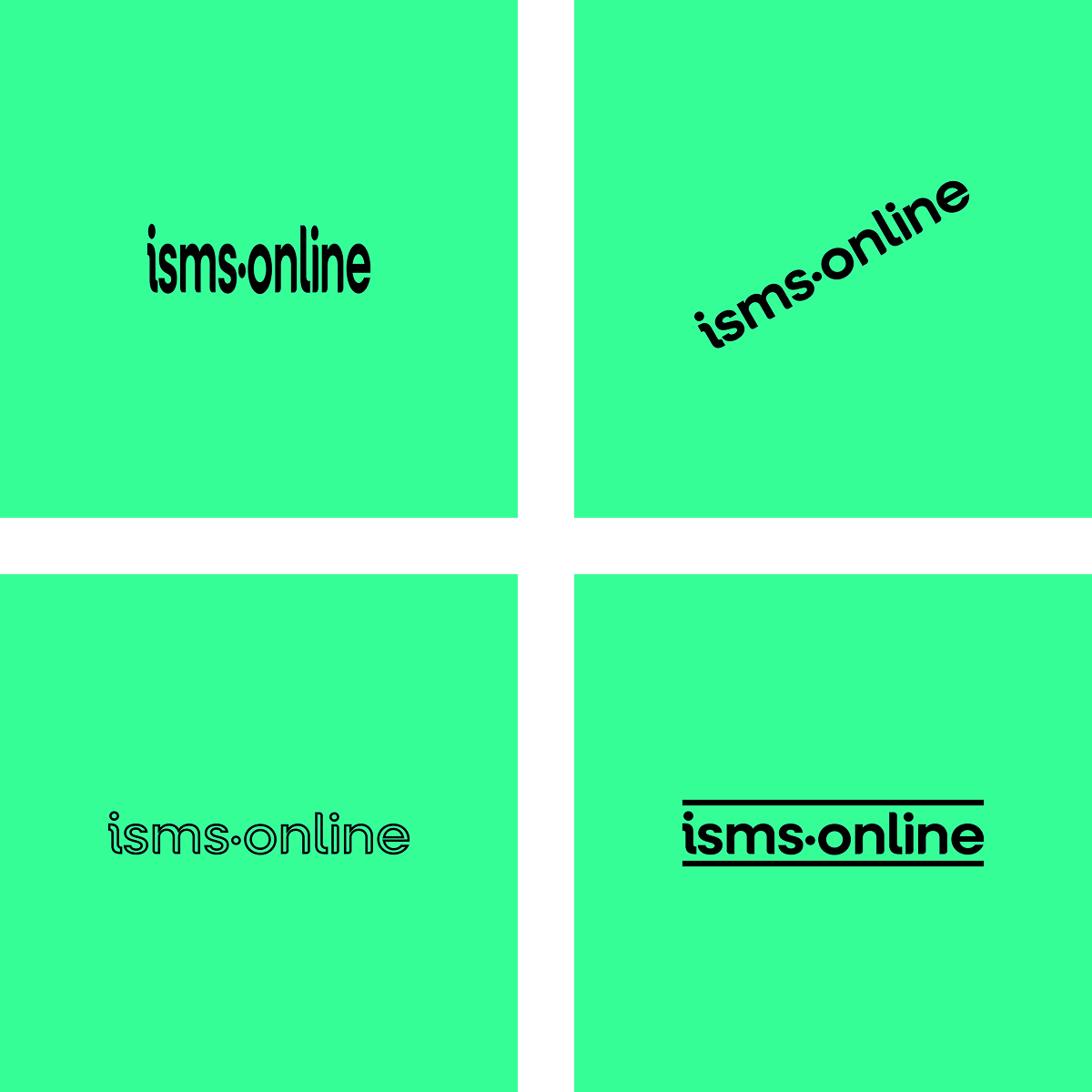
Wordmark – Don’t skew, rotate, outline, or add shapes.
Icon – Don’t skew, rotate, outline, or add shapes.
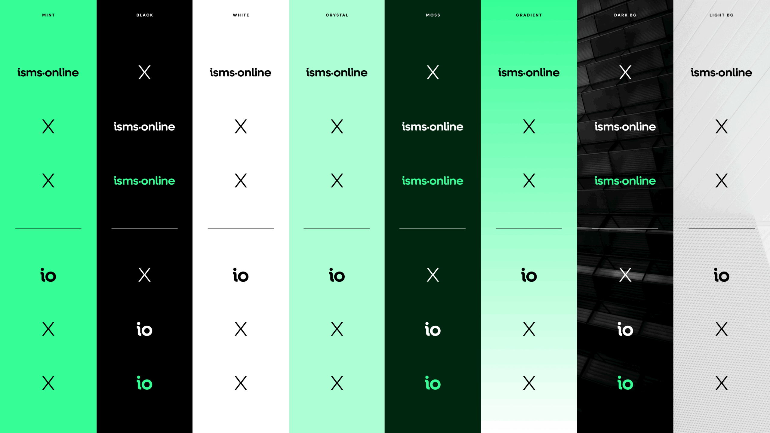
Logo Use Cheatsheet
For quick reference on the application of either the Wordmark or Icon, please adhere to these guidelines relating to colour and contrast combinations.
Colour Palette
Colour sets us apart and helps to invoke emotion. Our bold, confident palette, anchored by our signature electric mint, sets us apart and makes us instantly recognisable in a crowded market.
Primary
The primary IO colour palette defines the brand’s core identity. These colours are used most frequently across all touch points to ensure consistency and recognisability. Carefully selected for clarity, accessibility, and emotional resonance, they serve as the foundation for all visual communication, from logos to backgrounds and key elements.
Mint
HEX: #36FE97
RGB: 54, 254, 151
CMYK: 79, 0, 41, 0
Black
HEX: #000000
RGB: 0, 0, 0
CMYK: 60, 60, 60, 100
White
HEX: #FFFFFF
RGB: 255, 255, 255
CMYK: 0, 0, 0, 0
Moss
HEX: #00260F
RGB: 0, 38, 15
CMYK: 15, 0, 9, 85
Crystal 1
HEX: #EDFFF5
RGB: 237, 245, 255
CMYK: 8, 0, 7, 0
Crystal 2
HEX: #D5FFEA
RGB: 213, 255, 234
CMYK: 16, 0, 8, 0
Crystal 3
HEX: #AEFFD6
RGB: 174, 255, 214
CMYK: 34, 0, 28, 0
Expressive
The Expressive palette brings personality and emotion to the brand. These colours are used exclusively within our photography media to accentuate content and convey mood. These shades help diversify the visual language while remaining complementary to the primary palette, allowing for flexibility and dynamic engagement without compromising brand integrity or coherence.
Cyan
HEX: #36FDF6
RGB: 54, 253, 246
CMYK: 79, 0, 3, 1
Yellow
HEX: #FFE037
RGB: 255, 224, 55
CMYK: 0, 12, 78, 0
Orange
HEX: #FE8336
RGB: 255, 255, 255
CMYK: 0, 48, 79, 0
Purple
HEX: #9136FF
RGB: 145, 54, 255
CMYK: 43, 79, 0, 0
Pink
HEX: #FD36E9
RGB: 253, 54, 233
CMYK: 0, 79, 8, 1
Red
HEX: #FD365E
RGB: 253, 54, 94
CMYK: 0, 79, 63, 1
Blue
HEX: #365AFD
RGB: 54, 90, 253
CMYK: 79, 64, 0, 1
Utility
The Utility palette serves a functional role in the brand system, often used for UI elements, hover states or backgrounds. They ensure clear communication and accessibility, supporting user experience without drawing undue attention. These practical tones maintain consistency and clarity across digital and physical brand applications.
Mint Hover
HEX: #6FFFB7
RGB: 111, 255, 183
CMYK: 56, 0, 28, 0
Black Hover
HEX: #313131
RGB: 49, 49, 549
CMYK: 0, 0, 0, 81
Grey
HEX: #EEEEF1
RGB: 238, 238, 241
CMYK: 1, 1, 0, 5
Typography
Neulis Sans
Our primary typeface, Neulis Sans, has been specifically chosen with our target audience of infosec managers, CISOs, etc in mind. The straight-talking form of the geometric letter shapes represents the values of being reliable and experienced while appearing friendly, helpful, and approachable.
Neulis Sans Bold is used for all main headings.
Neulis Sans light can sometimes be used for subheadings if required.
When using Neulis Sans Bold at larger sizes, reduce the letter spacing by -2%. Line heights should be around 102% of the font size, tight enough to feel compact but never so tight that ascenders and descenders touch.
Bold (700)
Zero-trust policies jam big exploits while quirky hackers dodge verification.
aåbcçd∂eéfƒghiîjklmμnñoøpqoerstuüvwxyz
AÅÂBCÇDEFGHIÍJKLMNOØÓÔÒPQRSTUVWXYZ
0123456789º(.,’”-;:)!?&©˙˚π®†≈◊™£¢∞§•ªº
Light (300)
Zero-trust policies jam big exploits while quirky hackers dodge verification.
aåbcçd∂eéfƒghiîjklmμnñoøpqoerstuüvwxyz
AÅÂBCÇDEFGHIÍJKLMNOØÓÔÒPQRSTUVWXYZ
0123456789º(.,’”-;:)!?&©˙˚π®†≈◊™£¢∞§•ªº
‘Neulis Sans’ is a premium font available only through an Adobe Creative Could subscription.
Inter
Our secondary typeface is Inter. Inter is a highly legible sans-serif typeface designed for digital interfaces. Its clean, neutral design ensures excellent readability across screen sizes and resolutions. We use this for all body copy and small headings.
Inter Light is used for body copy.
Inter Bold is used for small headings, such as in-line highlights, section pre-titles and bullet list headings.
For body copy, generous line spacing is used to ensure legibility and a sense of calm. We tend to use around 150% of the body type size.
Light (300)
Zero-trust policies jam big exploits while quirky hackers dodge verification.
aåbcçd∂eéfƒghiîjklmμnñoøpqoerstuüvwxyz
AÅÂBCÇDEFGHIÍJKLMNOØÓÔÒPQRSTUVWXYZ
0123456789º(.,’”-;:)!?&©˙˚π®†≈◊™£¢∞§•ªº
Bold (700)
Zero-trust policies jam big exploits while quirky hackers dodge verification.
aåbcçd∂eéfƒghiîjklmμnñoøpqoerstuüvwxyz
AÅÂBCÇDEFGHIÍJKLMNOØÓÔÒPQRSTUVWXYZ
0123456789º(.,’”-;:)!?&©˙˚π®†≈◊™£¢∞§•ªº
‘Inter’ is a Google font and is available under the Open Font License. It can be downloaded and used for free.
Combining Typography & Colour
When using typography on any of our brand colours always keep legibility in mind. The simplest approach is often the best.
Always use black or white for body copy.
Headings should be black if used on white or mint, if using moss or black as the background then mint or white can be used.


Photography
We’re not a faceless company, and our branding should reflect that. Our photography is used to represent not only our customers, but the team behind the brand too, putting a face to the people who are here to help, giving a feeling of authenticity to our brand.
When used to represent our customers we demonstrate the feeling of confidence and elation when certification has been achieved, and celebrates the feeling of helpfulness which is at the core of what we do.
When used to represent our team we demonstrate the reliability of the expertise and support we offer to our customers.
Our expressive colour palette can be used behind portraits, adding a sense of vibrancy to the compositions, and occasionally overlapping the boundary makes the portraits less feel restricted.

Tone of Voice
We speak to our customers in clear, easy to understand language, empathetic to their needs and without using jargon, helping to get our message across far quicker. Think “savvy professional” with warmth, someone you’d trust to walk you through a complex process with clarity and reassurance.
When writing we should keep these tones in mind:
- Friendly but informed
- Confident but not boastful
- Helpful without being flippant
The word “Easy” is also something we’d lean away from, as “easy” can come across as dismissive to optimise users who know firsthand how challenging this space is. Instead, we would lean towards framing things as achievable, clear, structured, or simplified; whatever your complexity, we’ve got you.
Remember we’re not selling shortcuts, we’re selling confidence, clarity, and a track record of success.